Wednesday, December 18, 2013
Final and Stop motion
The above link is for the stop motion
The link above is my finaldney
The link above is for sy
My favorite thing about this course was taking pictures of different angles. My least favorite has to be the first project since I had no idea what I was doing. I learned how to photo shop which was cool now I can fix pictures. After high school if I ever need to upload a video to youtube i'll know how. I liked this course because of the discussion of how models are photo shopped now I don't look at magazines the same way. Good luck next year peace out!
Thursday, December 12, 2013
Redo Advertisement

I really liked how the advertisement had a ghostly kind of affect. I loved how the 4 different pictures were blended into the window. I thought it needed to be a little more clear on what the actual learner profile was. I didn't know the exact gaze position but other than that I thought the advertisement was great!
My revision
She asked for me to make it clearer on what topic I picked for this project so I thought why not put it in the middle of the picture. The font it's printed in comes from a mirror since mirrors reflect who we are. I also didn't want anything too bold that it takes over the picture but nothing not too small that it doesn't even show up. I also think it goes with the color scheme. I didn't want to change too much about the picture because I think it's as good as I can make it, definitely one of the best pictures I think I've done.
Tuesday, December 10, 2013

Wednesday, December 4, 2013
Critique Sydney
http://sydneybaldomero.blogspot.com/2013/12/product-advertisment.html
I like this product already because it makes me think of the outside and the caption is also clever. The usage of color is good though I would zoom in more on the bottle so the extra design on it won't distract the rest of the picture. And maybe zoom in on the picture all together to get rid of extra space. On the words I would add more depth to them so they pop out more. Also add a shadow effect on the hand so it looks like it's more apart of the picture. Plus zoom out on the hand or give it more space on the picture, have the hand in the picture more.
I like this product already because it makes me think of the outside and the caption is also clever. The usage of color is good though I would zoom in more on the bottle so the extra design on it won't distract the rest of the picture. And maybe zoom in on the picture all together to get rid of extra space. On the words I would add more depth to them so they pop out more. Also add a shadow effect on the hand so it looks like it's more apart of the picture. Plus zoom out on the hand or give it more space on the picture, have the hand in the picture more.
- Zoom Out on the hand and Zoom In on the picture all together.
- Add depth to the words.
- Add some of the burn tool to the hand.
Monday, December 2, 2013

Monday, November 25, 2013
Font style

I picked a scenery from Niagara Falls. I used the type mask tool then added a layer and changed the background and then I used satin and outer depth for the words to make them pop more. I used a red background to make reading the words easier.
Tuesday, November 19, 2013
Composition Shoot

Before Use the Whole Space

After
I changed it to black and white and then changed color hues to make certain objects pop out.

Before Run Off of Three Or More Edges

After
I cut the pole out and added brightness and a hue of blue. Then I cut Lauren out and made her lighter. Followed by the background which I gave a yellowish red hue. I made them all different to add layer and contrast.

Before A Variety of Shape and Sizes

After
I made it darker and added a purple photo filter to take away from the reflection so you can see the shape and sizes more. Also a hint of blue because blue just makes the whole picture stand out.

Before Repeat Shapes

After
I brought the brightness down and the contrast up to help see the bottles more and not the glass. Then I changed the vibrance and saturation to make the bottles look more apparent.

Before Focal Point

After
I completely changed the picture to an invert because I thought that the colors on the original one didn't make it have a focal point. So I cut out the chandelier to make it a little darker so it is different from the whole picture but not so different that it doesn't look apart of the picture.

Before Overlap To Create Depth

After
Since the picture is blurry I wanted to changed it to black and white so it looks blended more so than blurry. I then changed color saturation to make certain things darker so it looks overlapping.

Before S-Curve

After
I cut out her pants and made them many shades bluer. Then I cut out the background to make it black and white so she can be the main focus of the picture. Then I cut out her hair and made that darker so it balanced her out.

Before Make the Negative Space Interesting

After
I had to make the legs of the chairs stand out in a way so I added brightness and a lot of contrast. To make the chairs more apparent I added a blue hint.

Before Rule of Thirds

After
I had to crop it in order to have thirds. Added brightness and contrast and a reder hue along with a color balance of yellow, but just a little bit of yellow.
Tuesday, November 5, 2013

BEFORE

AFTER
My take on this picture is Darth Vadar doing a skin commercial. I find skin care products to be very false. You always have to have a certain kind of skin for the product to even work. Even then it might not do the job all the way through because in truth, I may never look like that model in the picture because I bet she doesn't even use the product constantly. Also, SHE IS PHOTOSHOPPED! It doesn't get anymore fake than that.
I also like the idea that he looks really creepy like a drug addict, only once haha. Usually in ads they like to use young, warm, inviting girls to bring the viewer into buying their products. They don't want to scare them away and this ad does exactly that. This picture would defently be unexpected if someone turned the page and saw his face for a skin ad.

BEFORE

AFTER
This is just purely for humor haha. But there's also the fact that I used a pig instead of an old man. Since Old Spice wants to attract men in this ad using an attractive woman. I thought why not attract the men for what some of them really are, pigs. Sure sex sells but to what I feel like the ad is doing, degrading women. Sure the text is funny and it put a smile on my face but it is a woman eating ice cream! It would be like her just standing there in a bikini rubbed in oil.
I also thought of someone eating ice cream in general. Icecream is fattening and today we are trying to get America healthy. If they eat grossly they are know as a pig. "you eat like a pig." People say this to tell someone keep your mouth shut and slow down. Also nothing could make this better than having the pig be in a pink bonnet because that shows that it is a girl pig. So when they say woman or she in the ad, the audience knows it is the pig.
Tuesday, October 8, 2013
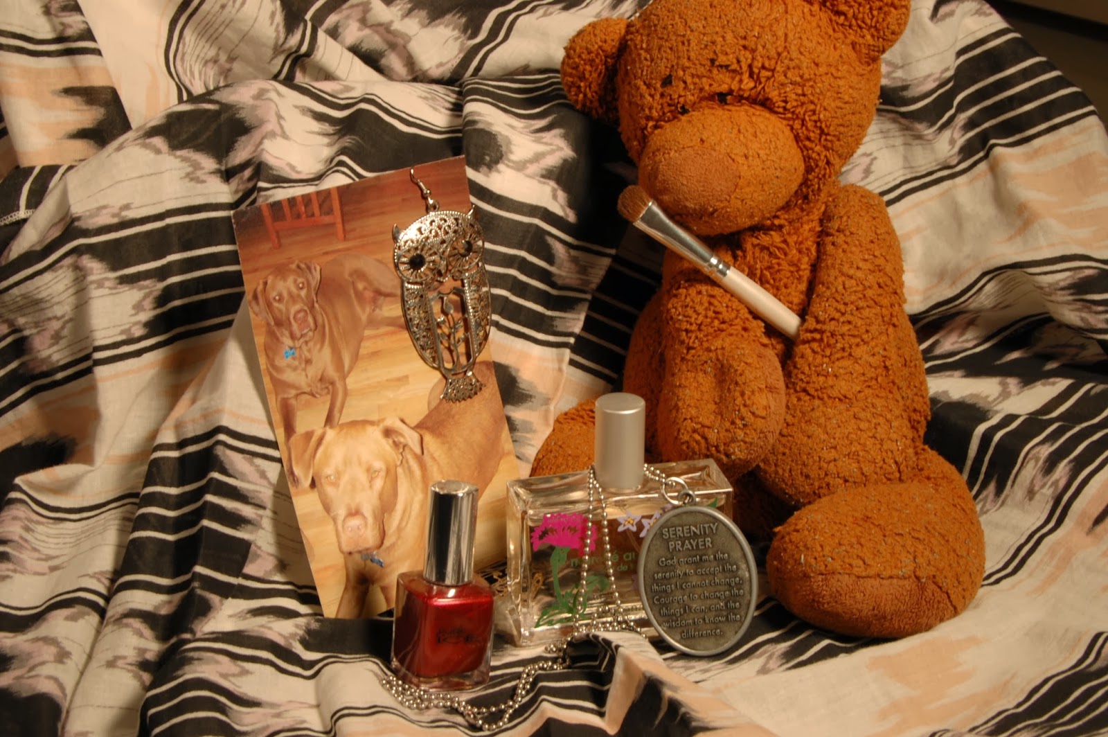
My items
- The Bear: My Dad gave that to me for my fourteenth birthday when he couldn't make it home because he was in Eastern Europe on bussiness.
- The picture of the dogs: Those are my dogs Luke and Carson and they mean the world to me.
- Owl earings: My best friend, Rachel, loves owls and it reminds me of her.
- Perfume: I got it in Europe for my first trip to Europe back in my shopmore year. It reminds me how much i loved it and how much I miss Europe.
- The necklace: My sister gave it to me to remind me of a very special message about change.
- Nail polish: It reminds me of my other sister because she is known for always having her nails painted and that is the color she always wears.
- Make-up brish: I love make up! I look on youtube for new make up ideas and i llike the concept that make up can change a person's look.

f/22; ISO 200

f/22; ISO 200
I basically brightened up the picture and got rid of some imperfections. Such as the headphones in the up right corner. And some things on the dogs pictures. For the lighting all of the classroom lights were on along with a light shining from the right of the picture.

f/22; ISO 200

f/22; ISO 200
Here i had all of the classroom lights on and the right lamp on. In the picture i darkened it and increased the red and orange saturation. I also fixed up the owl's eye to appear darker so the reflection doesn't make it disappear.

f/25; ISO 200

f/25; ISO 200
In this picture all of the classroom lights were off and the lighting came from one lamp on the left. I cut out certain objects in the picture so it would differ from the picture itself. I changed it to a dark blue hue and the objects to a gold to make them really pop.
f/16; ISO 200

f/16; ISO 200
All of the classroom lights are off and both right and left lamp are on. I changed the exposure and light along with the levels. I also cut out some images light the owl's eye's and the flowers on the perfume bottle.

f/16; ISO 200

f/16; ISO 200
All of the lights are off in the classroom but i had left and right lamps on along with another lamp on the left. I then took the quick selection tool to select the owl, nail polish, and make up brush. I made them darker and higher gold contrast. Then i inversed selected to make the background darker, along with black and white.

f/16; ISO 200

f/16; ISO 200
This was my last photo and the lights were off except the one on the right. I brightened it up and added some red hues and fixed the up right corner to look like the scarf was already there. Along with fixing the reflection on the owl's eye.
Wednesday, October 2, 2013
Photoshop warning?
Should we put a warning under things photoshopped?
My personal thoughts are we should put a warning label under models photoshopped pictures because it is harming the minds of women and over all false advertising. Even the women in the pictures don't look like that, they wish they did. But some think it is only a picture with a few touch ups, or is it? Personally I know that I sometimes wish to be thinner and have better skin when I look at people in magazines, but I wouldn't feel so pressured into that way of perfection if I new that the models in the picture don't even look like the models in the picture. Before I saw this video I didn't even know that almost every single picture in a magazine was photoshopped. If I didn't even know that then how can people expect others to know that this picture of perfection isn't so perfect at all? What kind of message are we sending out to our children girls and even boys? I say boys because there are also men models that are photoshopped to either make their skin look better or their muscles look bigger. It is not just men and women that are affected by this lie, but also our children. There should be a label on pictures that are photoshopped so then people will know if I buy this product I won't look like them, I am perfect the way that I am.
The link below gives more of a perspective on this issue:
http://www.youtube.com/watch?v=wUb5PZHcovA
Monday, September 30, 2013
Light exposure

f 3.5 Before

f 3.5 after
I brightened up the picture to get a better look at it. Added some blue and green hue since those are the main colors and I changed the background to a darker brown so there is a strict difference between the water bottle and the back wall.

f 36 before

f 36 after
I brightened up the picture but I should've taken the picture farthure out instead of so close to the water bottle. I also changed the exposure so it could make it brighter and also added a slite green hue.

f 18 before

f 18 after
I only brightened the picture a little bit because there was so much going on that i didn't want to white it out. Also i changed the levels to make some brighter and other levels darker.
Wednesday, September 25, 2013
Our History
MYP Units
Unit: Documenting our World
Unit Question: What is the value of recording history?
Significant Concepts:
Unit Question: What is the value of recording history?
Significant Concepts:
- Humans record history for many reasons.
- We are currently writing history.
- History can vary depending on the source.
My Thoughts
The value of recording human history is to not repeat mistakes already made by others. For instance how we handled Hitler as a little issue and it grew to a bigger problem. The same goes for Syria, if we treat this cause as something that is not important and can just be persuaded out of then there is a possibility for another war. Yet how serious is the cause? I don't want to find out the hard way.
I believe it is a need for humans to write down history whether it is of an event or of themselves. Humans want to feel like they are leaving something behind and want to be remembered for it. humans don't want to be a nameless headstone, they want meaning to their life even after it has ended.


Thursday, September 19, 2013
Color Wheel Finished

The Color Wheel
I loaded all of the pictures onto photoshop to put them in order. I decided to put them in a wheel pattern so it is easier to understand which colors of the pictures I am using. I started by the lockers in the freshman halls and progressively went down the hallway. I took the pictures zoomed in so I could focus on the color itself. I like the picture of the water bottles the most.
Tuesday, September 17, 2013

Friday, September 13, 2013


Subscribe to:
Comments (Atom)